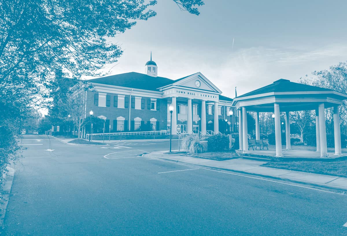


Town of Matthews Case Study Challenge With a population exceeding 30,000 residents, the Town of Matthews struggled to unify its historic downtown area to the rest of its sprawling community while still preserving its unique charm. They needed to showcase their downtown area as an economic hub: one which would continue attracting tens of thousands of people each year and become an epicenter of family-friendly events. We served as a strategic partner in their rebranding events and providing website art direction. During the two-year partnership, our team developed “Love Matthews,” a 4-week marketing campaign, and designed monthly publications with consistent 50% or above open rates. Services
- Brand Identity Development
- Event Logo Redesign
- Website Art Direction
- Video Production
Solution We partnered with the Town of Matthews to provide a brand storyboard which included a revamped color story, event logos, and font guide. The rebranding also included newly designed event logos for three of the town’s major recurring community events: Food Truck Fridays, Pawsitively Matthews, and Beach Fest. Supporting social media and print materials were also included to create a cohesive look for the event. The official Waxhaw logo, which has remained consistent since 2008, uses a font that was drawn specifically for the Town and was meant to represent the train tracks. We made slight tweaks to update the red color from the previous logo because the general feedback was that it looked like “Christmas colors.” The new logo uses the brand “Wine” (maroon) color. Spirited greens found in the rolling hills and lush town landscapes gives energy to a sophisticated and refined wine color. Such a delightful tapestry of vibrant shades are a contrast to the richly bronzed brown and soothing ecru representing the polished train rails and iconic walkover bridge. Airy touches of teal inspired by vintage glass bottles bring a calming familiarity to round out the color palette. Waxhaw’s fonts were chosen to depict the rustic refined design influence. Thirsty Rough and Veneer, which are used interchangeably for headlines or sub-headlines are vintage letterpress style fonts. "Quote Pending" Source Title, Association Results With clearly defined messaging and branded materials, the Town of Matthews developed signage, social media graphics, and launched a new website to convey a cohesive look and feel for the town events and communications collateral. In the summer of 2019, we began producing a monthly digital newsletter to communicate important information and upcoming events with the town’s residents and stakeholders. During that time, we was also commissioned to design a “Love Matthews” logo, which spun off into a 4 week marketing campaign that included t-shirts, signs, and promotional videos. The Town of Matthews now has a cohesive visual presence and the Love Matthews videos are among the highest viewed videos on their site.


.avif)